Project Overview
Hue started as a small internal tool for generating soothing gradient artwork and grew into a public publishing platform. The challenge was to design an interface that stays out of the way and lets the artwork breathe.
The project covered everything from the naming and visual identity to the publishing flow itself — a full brand and product engagement over four months.
Our Process
We began with a short discovery sprint: interviews with the founding team, an audit of similar creative platforms, and a series of visual territories to align on direction before any screens were designed.
Research
Conversations with twelve designers revealed a common frustration: most inspiration platforms are noisy. People wanted a place that felt more like a gallery than a feed — fewer numbers, no infinite grid, more air.
Visual Direction
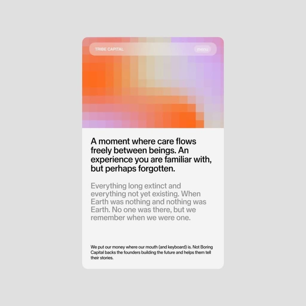
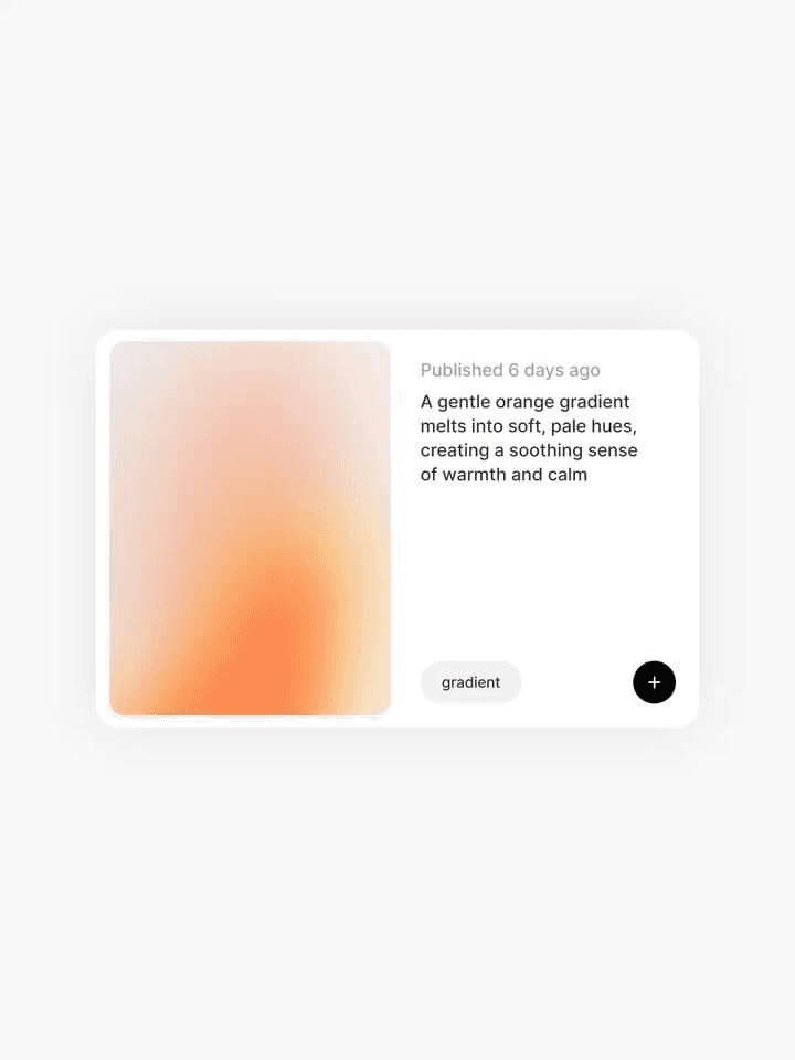
We landed on a card-based layout with generous whitespace, a muted neutral palette and a single accent color. Every gradient is published with a short, almost poetic description — the interface treats these texts as part of the artwork.
Design Decisions
The publishing flow was reduced to three steps: upload, describe, publish. Metadata is generated automatically, and the description field is intentionally limited in length to keep the tone consistent across the platform.
Typography does the heavy lifting. A single sans-serif family in two weights keeps the interface quiet, while the artwork provides all the color.
Key Impact
Within three months of launch, Hue reached 4,000 weekly readers with zero paid acquisition. The brand system extended naturally into social media and print, and the team now ships new collections without design support.
Reflections
The biggest lesson: restraint is a feature. Every element we removed made the artwork stronger — and the product calmer.